

In today’s digital landscape, where the majority of users access websites through various devices, responsive web design has become more important than ever. As technology continues to evolve, so do the trends in web design. Keeping up with the latest responsive web design trends is crucial for businesses and individuals seeking to create engaging online experiences.
From bold and vibrant color schemes to minimalist and clean layouts, responsive web design trends are constantly evolving to meet the ever-changing needs and preferences of users. By adapting to these trends, websites can ensure that they provide a seamless and user-friendly experience across all devices, making it easier for visitors to navigate, engage, and convert. So, let’s explore some of the top responsive web design trends that can elevate your website and captivate your audience.
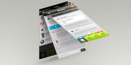
Source: designer-daily.com

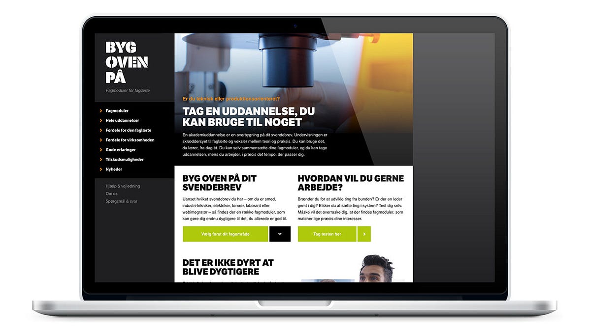
Source: premiumcoding.com
What is responsive web design?
Responsive web design is an approach to web design and development that aims to create websites that provide optimal viewing and interaction experiences across a wide range of devices and screen sizes. With responsive design, the layout and content of a website automatically adjust and adapt to fit the screen it is being viewed on, whether it’s a desktop computer, a tablet, or a smartphone.
This is achieved through the use of flexible grids, responsive images, and CSS media queries that target different screen sizes and apply appropriate styles and layouts accordingly. The goal is to ensure that users can easily navigate and consume the website’s content regardless of the device they are using.
Why is responsive web design important?
Responsive web design is important because it allows businesses and individuals to reach and engage with a larger audience. With the increasing use of mobile devices, having a website that is optimized for mobile viewing is crucial. It not only improves the user experience but also helps with search engine optimization as search engines like Google prioritize mobile-friendly websites in their search results.
Moreover, responsive web design eliminates the need for creating separate websites or mobile apps for different devices, which can be time-consuming and costly. It provides a more efficient and cost-effective solution by ensuring that a single website can adapt to multiple devices, saving both time and resources.
What are the current trends in responsive web design?
There are several trends in responsive web design that are gaining popularity:
- Mobile-first design: With the majority of internet users accessing websites through mobile devices, designing websites with a mobile-first approach has become a common practice. This involves prioritizing the mobile experience during the design process and then adapting it for larger screens.
- Microinteractions: Microinteractions are small animations or interactions that provide feedback to users and enhance the overall user experience. They can be used to guide users, highlight important elements, or provide visual cues.
- Minimalistic design: Minimalistic design focuses on simplicity and clean aesthetics. It often involves the use of ample white space, simple typography, and a limited color palette. This trend helps to create a visually pleasing and clutter-free experience for users.
How can I make my website responsive?
To make your website responsive, there are several key steps you can follow:
- Use a responsive framework or template: There are many responsive frameworks and templates available that provide a solid foundation for building responsive websites. These frameworks typically include responsive grids, CSS styles, and other components that can be customized to fit your needs.
- Implement CSS media queries: CSS media queries allow you to apply different styles and layouts based on the screen size and device being used. By targeting specific screen sizes, you can adjust font sizes, image sizes, and layout structures to ensure optimal viewing experiences.
- Optimize images: Images often take up a significant amount of bandwidth and can slow down page loading times on mobile devices. Use responsive image techniques, such as using the srcset attribute or CSS media queries, to serve appropriately sized images based on the device’s screen size.
- Test across devices: It’s important to test your website on various devices and screen sizes to ensure that it is truly responsive. Use device emulators, browser developer tools, or physical devices to check how your website looks and functions on different platforms.
What are the benefits of responsive web design?
Responsive web design offers numerous benefits:
- Improved user experience: Responsive websites provide an optimal viewing experience across devices, ensuring that users can easily navigate and consume content. This can lead to increased engagement, longer visit durations, and higher conversion rates.
- Cost and time savings: With a responsive design, you only need to maintain and update a single website instead of multiple versions for different devices. This saves time and resources in development, content management, and maintenance.
- Better SEO performance: Search engines like Google prioritize mobile-friendly websites in their search results. Having a responsive website can improve your search engine rankings and visibility, leading to more organic traffic.
- Future-proofing: As new devices with different screen sizes and resolutions are introduced, responsive web design ensures that your website will continue to adapt and look great on these devices. This helps future-proof your website and keeps it relevant for years to come.
Is responsive web design suitable for all types of websites?
Responsive web design is suitable for most types of websites, including business websites, blogs, e-commerce sites, and news portals. However, there may be cases where a different approach, such as adaptive design or a separate mobile app, is more appropriate.
For example, if your website requires complex interactions or heavily relies on specific device capabilities, a separate mobile app might be a better choice. Additionally, some content-heavy websites may benefit from adaptive design, which allows for more tailored experiences based on the user’s device.
Ultimately, the decision on whether to use responsive web design or another approach depends on the specific requirements and goals of your website.
What are the potential challenges of responsive web design?
While responsive web design offers many advantages, there can be challenges to consider:
- Complexity: Responsive web design can be more complex and time-consuming to implement compared to traditional, non-responsive design. It requires careful planning, testing, and consideration of various screen sizes and device capabilities.
- Performance optimization: Ensuring that a responsive website performs well across different devices and screen sizes can be challenging. Optimizing images, minimizing code, and utilizing caching techniques are some of the strategies that can help improve performance.
- Content prioritization: With responsive design, it’s important to prioritize content based on screen size and importance. This can require making difficult decisions about what content to display or hide on smaller screens to maintain a clean and user-friendly experience.
Are there any alternatives to responsive web design?
Yes, there are alternative approaches to responsive web design:
- Adaptive design: Adaptive design involves creating multiple versions of a website, each specifically tailored to a particular device or screen size. This approach allows for more control over the user experience but requires more development and maintenance effort.
- Separate mobile app: In some cases, it may be more appropriate to develop a separate mobile app rather than a responsive website. This is particularly true if your website requires complex interactions or relies heavily on specific device capabilities.
It’s important to carefully consider your project requirements, budget, and target audience when choosing between responsive web design and alternative approaches.
How can I stay up-to-date with the latest responsive web design trends?
Staying up-to-date with the latest responsive web design trends is essential to ensure that your website remains relevant and competitive. Here are some ways to stay informed:
- Follow industry blogs and websites: There are numerous blogs and websites dedicated to web design and development that regularly publish articles about responsive design trends. Subscribe to their newsletters or RSS feeds to receive updates directly in your inbox.
- Join online communities and forums: Participate in online communities and forums where web designers and developers share their knowledge and discuss the latest trends. Platforms like Stack Overflow, Reddit, and social media groups can be great sources of information and inspiration.
- Attend conferences and webinars: Industry conferences and webinars often feature presentations and workshops on responsive web design trends. Attending these events can provide valuable insights and networking opportunities.
Should I redesign my existing website to be responsive?
Whether you should redesign your existing website to be responsive depends on various factors:
- Current website performance: If your current website is not mobile-friendly and is experiencing low engagement or high bounce rates on mobile devices, it may be beneficial to redesign it to be responsive.
- Business goals: Consider your business goals and whether a responsive website aligns with them. If reaching a mobile audience or improving search engine visibility is important to your business, a responsive redesign can be beneficial.
- Budget and resources: Redesigning a website can be a significant investment in terms of time and resources. Consider your budget and available resources before deciding to undertake a responsive redesign.
It’s important to evaluate your specific situation and consult with web design professionals to determine if a responsive redesign is the right choice for your website.
How can I optimize my responsive website for search engines?
To optimize your responsive website for search engines, consider the following strategies:
- Ensure mobile-friendliness: Make sure your website is mobile-friendly and passes Google’s mobile-friendly test. This includes using responsive design, optimizing images, and ensuring that the website is fully functional on mobile devices.
- Optimize page speed: Page loading speed is an important ranking factor for search engines. Optimize your website’s performance by minimizing code, compressing images, and utilizing caching techniques.
- Focus on mobile keywords: Conduct keyword research specifically for mobile search queries. Mobile users often have different search behavior and may use shorter or more localized keywords.
- Optimize meta tags: Create unique and descriptive meta titles and descriptions for each page on your website. Make sure they are concise, relevant, and optimized for mobile search results.
- Utilize structured data: Implement structured data markup to provide search engines with additional information about your website’s content. This can enhance search results with rich snippets and improve visibility.
What is the role of typography in responsive web design?
Typography plays a crucial role in responsive web design. It involves the selection, arrangement, and styling of fonts to enhance readability and aesthetics across different screen sizes.
When designing for responsiveness, it’s important to consider the legibility of text on smaller screens. Choose fonts that are easily readable at various sizes and ensure that line lengths and spacing are optimized for readability.
Responsive typography can also involve using CSS media queries to adjust font sizes, line heights, and other typographic properties based on the screen size. This ensures that text remains legible and visually appealing on both desktop and mobile devices.
Should I use a mobile-first or desktop-first approach for responsive web design?
Both mobile-first and desktop-first approaches have their merits, and the choice depends on your project requirements and target audience.
A mobile-first approach involves designing and developing for mobile devices first, and then progressively enhancing the experience for larger screens. This approach prioritizes simplicity, performance, and usability on mobile devices, which are increasingly dominant in web traffic.
On the other hand, a desktop-first approach involves designing for desktop screens first and then adapting the layout and features for smaller screens. This approach may be more suitable if your target audience primarily uses desktop devices or if your website requires complex features that are better suited for larger screens.
Ultimately, the decision between mobile-first and desktop-first depends on your project goals, target audience, and the specific requirements of your website.
What is the impact of responsive web design on website performance?
Responsive web design can have both positive and negative impacts on website performance:
Positive impact:
- Improved user experience: Responsive websites provide a better user experience by adapting to different screen sizes and devices, which can lead to increased engagement and conversions.
- Single codebase: With responsive design, you only need to maintain and update a single codebase, which can be more efficient and cost-effective compared to developing separate versions for different devices.
Negative impact:
- Performance optimization challenges: Optimizing a responsive website for performance across various devices and screen sizes can be challenging. Images, JavaScript, and CSS files need to be optimized to minimize loading times.
- Increased page size: Responsive websites can have larger file sizes due to the need to cater to different devices. This can impact page loading times, especially on slower connections.
To mitigate potential performance issues, it’s important to optimize assets, minimize code, and utilize caching techniques to ensure a fast and smooth browsing experience for users.
What is the role of user testing in responsive web design?
User testing is a crucial part of the responsive web design process. It involves gathering feedback and insights from real users to evaluate the usability, functionality, and overall user experience of a responsive website.
Through user testing, you can identify any issues or pain points that users may encounter when accessing your website on different devices. This feedback can help inform design decisions and guide improvements to ensure that your website meets the needs and expectations of your target audience.
There are various methods of user testing, including usability testing, A/B testing, and remote testing. By involving real users in the design process, you can gain valuable insights and make data-driven decisions to optimize your responsive website.
How can I ensure that my responsive website is accessible to all users?
Ensuring that your responsive website is accessible to all users is important for providing an inclusive and equal user experience. Here are some key considerations:
- Use semantic HTML: Properly structured HTML with semantic elements helps screen readers and assistive technologies understand the content and navigate the website effectively.
- Provide alternative text for images: Adding descriptive alternative text (alt text) to images allows visually impaired users to understand the content of the images through assistive technologies.
- Ensure color contrast: Use sufficient color contrast between text and background to make it easier for visually impaired users to read the content. WCAG guidelines provide specific guidelines for color contrast ratios.
- Keyboard accessibility: Ensure that all interactive elements on your website can be easily accessed and navigated using a keyboard alone. This includes proper focus management and providing visible focus indicators.
- Test with assistive technologies: Test your website with screen readers, keyboard navigation, and other assistive technologies to identify any accessibility issues and ensure a smooth experience for all users.
What is the future of responsive web design?
The future of responsive web design is likely to involve further advancements and innovations to address emerging technologies and user expectations:
- Responsive design for new devices: As new types of devices, such as smartwatches, virtual reality headsets, and Internet of Things (IoT) devices become more prevalent, responsive web design will need to adapt to cater to these unique form factors.
- Performance optimization: As internet speeds improve and users’ expectations for fast-loading websites increase, performance optimization will remain a key focus of responsive web design to ensure smooth and efficient browsing experiences.
- Advanced interactivity: With the increasing capabilities of web technologies, responsive websites will likely incorporate more advanced interactivity, such as augmented reality, voice interfaces, and seamless transitions between devices.
- Personalization and customization: Responsive web design may incorporate more personalized and customized experiences based on user preferences, location, and other contextual factors to enhance user engagement and satisfaction.
Overall, the future of responsive web design will continue to evolve to meet the changing needs and expectations of users in an increasingly connected and diverse digital landscape.
Source: medium.com
Frequently Asked Questions
Welcome to our Frequently Asked Questions section on the latest trends in responsive web design. In this segment, we will address some common queries related to creating websites that adapt to different devices and screen sizes. Discover the key insights and guidelines to keep up with the exciting world of responsive web design.
Q: Why is responsive web design important for modern websites?
A: Responsive web design is crucial in today’s digital landscape because it ensures that websites can adapt to different devices, such as smartphones, tablets, and desktop computers. With the growing number of users accessing the web through various devices, it is essential that websites provide a seamless and consistent experience across all platforms. By utilizing responsive design techniques, websites can automatically adjust their layout and content to fit different screen sizes, making them accessible and user-friendly. This improves user engagement, boosts search engine ranking, and ultimately results in higher conversion rates.
Furthermore, responsive design eliminates the need for multiple versions of a website tailored to different devices, reducing development and maintenance costs. It also streamlines content management, as updates and changes only need to be made once, rather than for each version of the website. In summary, responsive web design is vital for ensuring optimal user experience, accessibility, and efficient website development.
Q: What are some current trends in responsive web design?
A: One of the key trends in responsive web design is the use of mobile-first design principles. As mobile usage continues to rise, designers are prioritizing the mobile experience and designing websites primarily for smaller screens. This approach ensures that the core content and functionality are optimized for mobile devices, with additional features and enhancements added for larger screens.
Another trend is the implementation of smooth and intuitive navigation. With limited screen space on mobile devices, responsive websites are adopting innovative navigation techniques, such as hidden menus, collapsible sidebars, and sticky headers, to provide seamless user experiences. These design choices make it easier for users to navigate through the site, access important information, and engage with the content without feeling overwhelmed by cluttered layouts.
Q: How can I optimize images for responsive web design?
A: Image optimization is crucial for responsive web design to ensure fast loading times and optimal performance across all devices. One effective technique is to use responsive images, which dynamically adjust based on the user’s screen size. This prevents oversized images from slowing down the website on mobile devices or serving low-quality images on larger screens.
Another important strategy is to compress images without compromising quality. This reduces file sizes and improves loading speed. Numerous tools and plugins are available that can automatically compress images during the website development process. Additionally, using the appropriate image file formats, such as JPEG for photographs and PNG for graphics, can further optimize image delivery and display on different devices.
Q: How can I ensure my responsive website is accessible to all users?
A: Creating an accessible responsive website involves several considerations. First and foremost, ensure that the website is compatible with assistive technologies, such as screen readers, by utilizing proper HTML semantics and providing alternative text for images. Semantic markup assists assistive technologies in accurately interpreting and conveying the content to users with disabilities.
Additionally, make sure that the website meets accessibility standards, such as those outlined in the Web Content Accessibility Guidelines (WCAG). This includes factors like color contrast, keyboard navigation, and text scalability. Regular accessibility testing and user feedback can help identify any issues and ensure continuous improvement in this aspect of responsive web design.
Q: What are the potential challenges of implementing responsive web design?
A: While responsive web design offers many benefits, it can present some challenges during implementation. One common challenge is testing and ensuring consistent performance across different browsers and devices. With a wide range of screen sizes, resolutions, and operating systems, thorough testing is necessary to ensure the website functions properly in all scenarios.
Another challenge is content prioritization. As designs adapt to different screen sizes, it is essential to prioritize content based on importance and relevance. This requires careful planning and decision-making to ensure the most critical information is showcased prominently while still maintaining a visually appealing layout.
Web & UI Design Trends for 2024
Conclusion
In conclusion, responsive web design is an essential trend for modern websites. It allows websites to adapt and provide optimal user experiences across different devices and screen sizes. By using flexible grids, media queries, and fluid images, responsive design ensures that content is easily accessible and readable on smartphones, tablets, and desktops.
One key trend in responsive web design is the use of mobile-first approach. Designers are now prioritizing mobile devices when creating websites, considering the smaller screen sizes and touch interactions. This approach helps to ensure that the most important content and functionalities are accessible to mobile users, improving user satisfaction and engagement.
Another important trend is the adoption of responsive typography. Designers are now using fonts that automatically adjust in size and spacing based on the user’s device, creating a seamless reading experience. This trend not only enhances readability but also contributes to the overall aesthetics of the website.
Furthermore, the use of responsive images is gaining popularity. By using techniques such as CSS media queries and HTML picture element, designers are able to deliver optimized images that look great on any device, without sacrificing loading speed.
Overall, the key trends in responsive web design revolve around creating user-friendly experiences across devices, optimizing typography, and implementing responsive images. By embracing these trends, websites can provide a consistent and enjoyable experience to users, regardless of the device they are using.


